Process Matters: Creating the Best User Experience at Connect@Cal
12 Sep 2020A few months ago, Johnny Nguyen, Eric Cheng, and I created a nonprofit student org that helps connect personalized resources with students called Connect@Cal.
Our mission is to connect every student to the right resources at the right time.
We believe that the overabundance of information, siloed resources, and the state of UC Berkeley’s support system have inhibited students from achieving holistic wellness on campus. Our program will serve as a trusted resource hub connecting students to the most relevant services and programs.
Right from the start, we wanted to create an intuitive and efficient system that helps our users easily articulate their needs as well as quickly receive personalized resources. To achieve this goal, we focused on both designing an intuitive experience for our users as well as building tools for our team to help them support our users.
For our user experience, we wanted to design it so that when a user lands on our webpage, they immediately understand what we do and how they can get the resources they need. For our internal experience, we wanted to create a website that helps our associates effectively identify unresolved cases and correlate information in those cases with our internal databases so that they can create the most relevant and effective response to our clients.
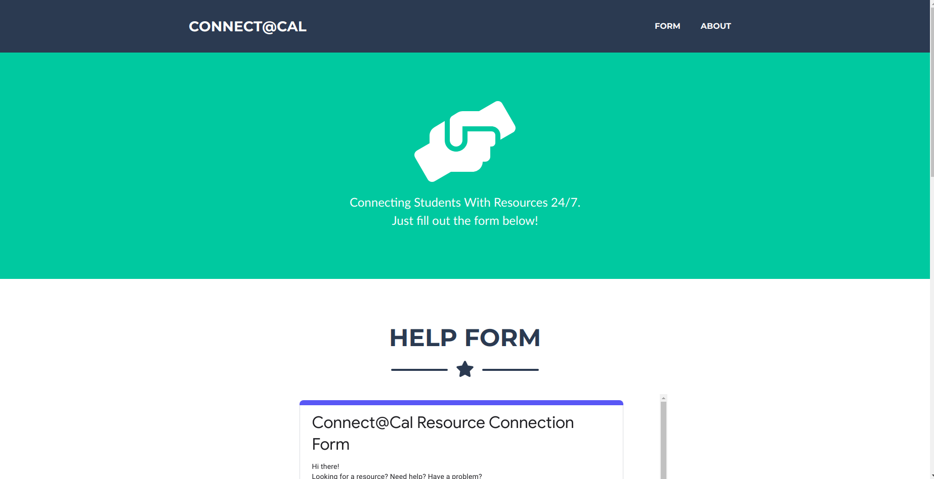
Originally when our tech team was just me and Eric, we quickly built this for our beta site so that we could launch quickly:

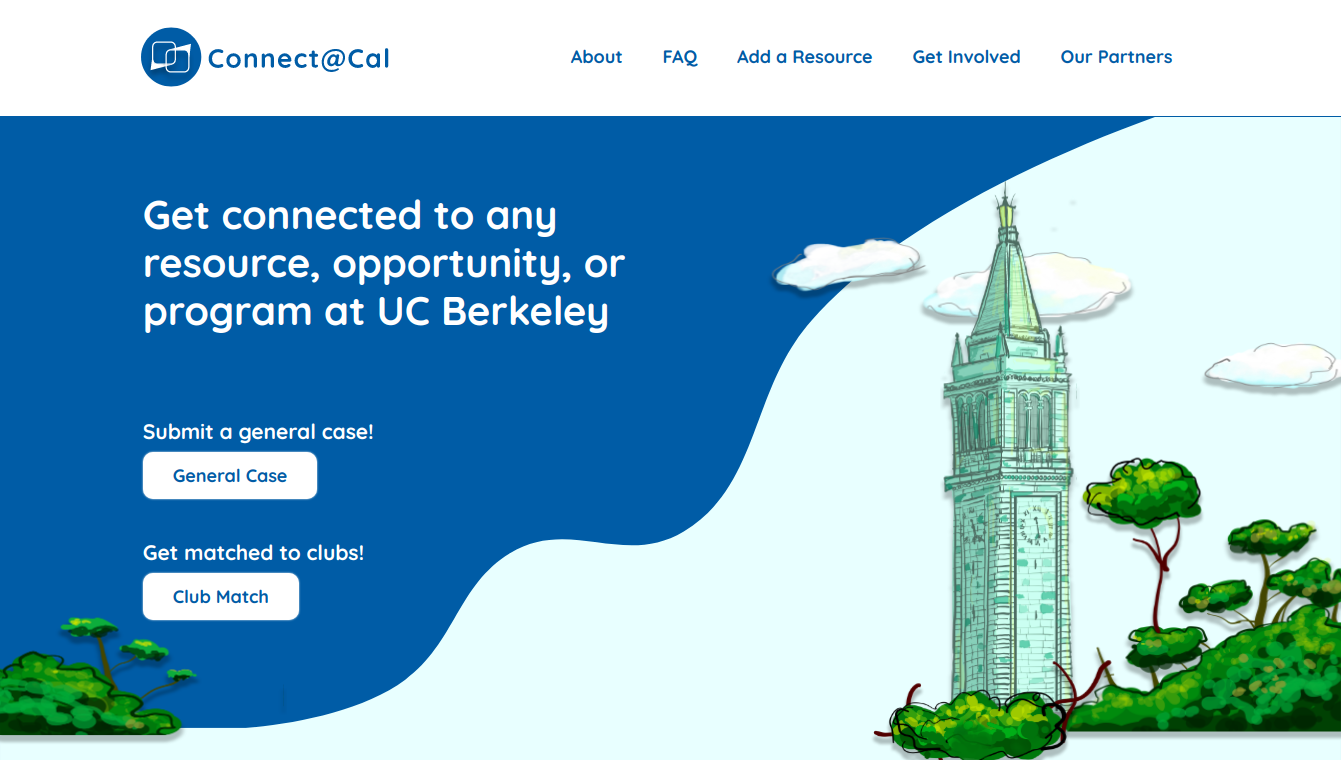
Then, after Dana Feng joined our team, we were able to completely redesign our user experience:

How were we able to accomplish this?
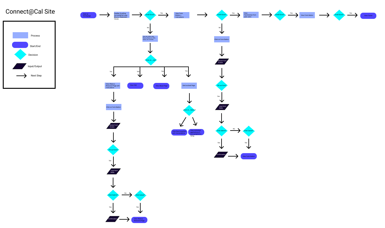
After we launched our original website, we soon realized from our analytics that users weren’t using our platform for our intended goal in mind. After meeting with our business development teams, we identified that the main issue with the beta website was that it looked untrustworthy and was not user friendly. So, we created a user workflow diagram that maps out how various users could interact with our website to figure out what we needed to change as well as build for our website:

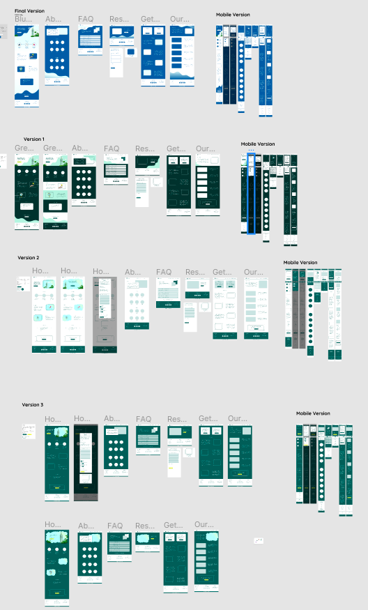
After we understood the various paths users took on our website, we created high fidelity mockups of our user website so that we could continuously experiment and visualize different approaches for features we wanted to build:

Lastly we wrote the website code, tested it out on mobile and desktop devices, and then launched it 🚀. Over the last few weeks, we have been able to steadily decrease our bounce rate by 3% weekly while also increasing our amount of cases by ~10% weekly.
Throughout this redesign, we learned that process matters.
Oftentimes, when we feel really passionate about a problem, we jump right into building a solution without walking through every possible user path. By taking a step back and revisiting how the user uses our platform, we were able to check our own assumptions of what users want and figure out the potential holes within our existing model and fix them. Afterwards, we explicitly constructed mockups before coding out our website. If we didn’t have mockups before, we could have inadvertently left out important user feature(s) as well as potentially created code that would have never been used. Having a structured and systematic process of redesigning our website helped us create the best possible website for our users while also enabling our tech team to work efficiently.
Connect@Cal’s north star is to create the most effective platform for students at Berkeley to find relevant resources that will help them find their communities, calling, etc. As learned throughout our redesign process, we need to continue to create structured processes to ensure we are producing the highest quality features that users want and need.
If you interested in hearing more about Connect@Cal, follow our Instagram and Facebook to stay posted on our upcoming partnerships and projects!
In my next blog, I’ll talk about how we redesigned and built from scratch our internal tools which allow our associates to effectively identify resources for students! In the next few months, keep your eyes out for even more blog posts on our new features such as our upcoming chat bot.